
Invasys · Product Design · Design Systems · UX/UI
One Design System. Multiple Products.
Building a shared UI foundation across existing products, designing for changing product requirements, and supporting the development of a new product.
The challenge
Two existing products had evolved with different UI foundations: one based on Material UI (MUI), the other on custom components. This made it harder to maintain a consistent interface across the product family.
My focus was to create a common design foundation that could support both products without duplicating the component library for each application.
One source of design
I designed a shared Figma design system with reusable components, design tokens, and interaction patterns. The same library became the source for interface design across both existing products — and later for a new product.
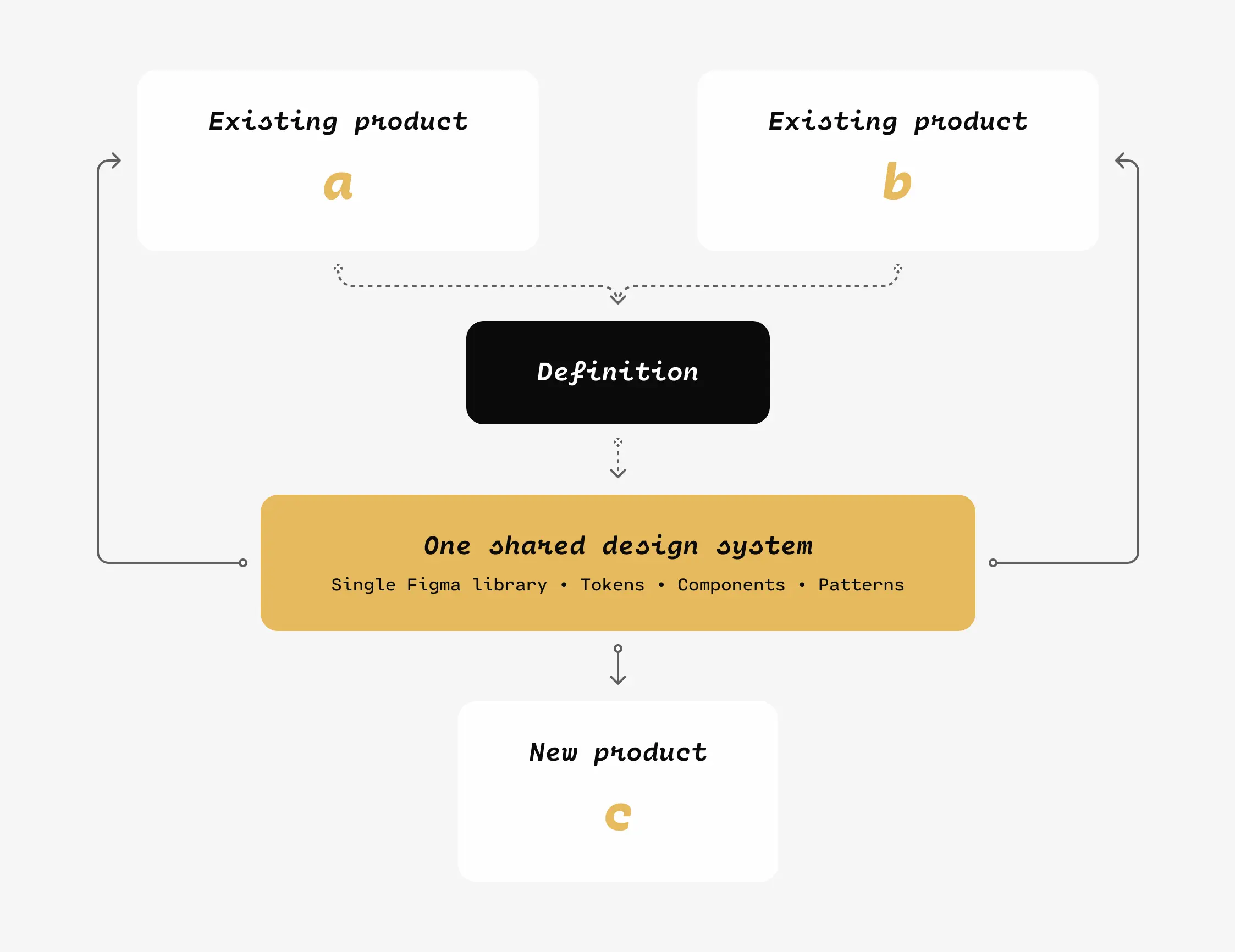
The goal was not simply visual consistency. Shared components and rules provided a maintainable starting point for new interfaces while keeping design decisions aligned across products.
Structuring the Design System
Beyond creating reusable components, I established a naming convention for design tokens to organize their purpose, context, and application across the system.
The structure separates namespaces, elements, visual patterns, variants, properties, and modifiers. This provides a consistent approach to defining tokens across different components and interface states.
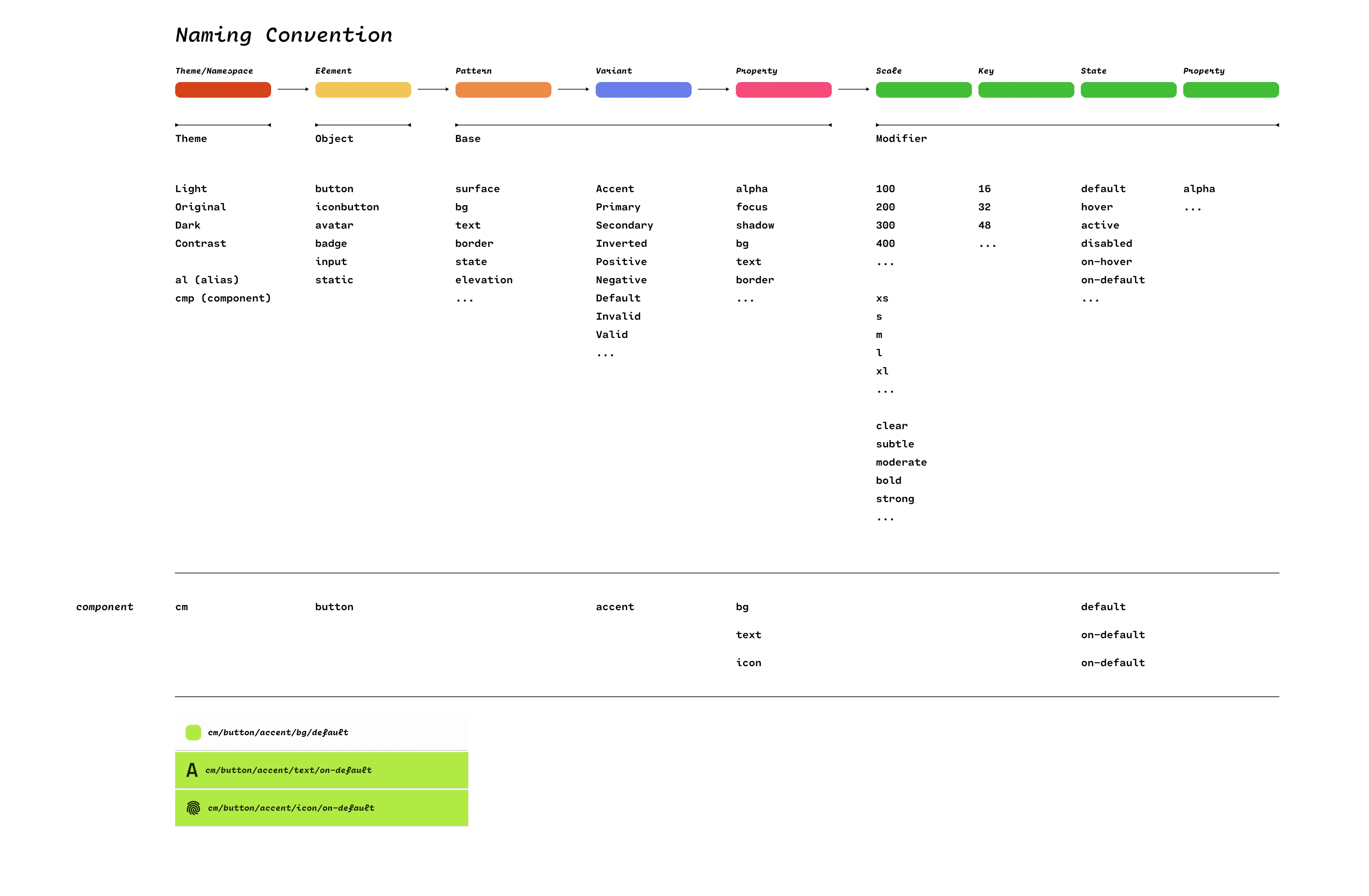
For example, button tokens distinguish between background, text, and icon properties, allowing each to be managed independently while following the same naming structure.
Scaling status visibility — from 12 to 30 slots
One component-level challenge emerged as the product evolved. The original interface displayed up to 12 slots using circular indicators distinguished primarily by green, orange, and red. A newer version needed to represent up to 30 slots, making the original approach less suitable for the available horizontal space.
Vertical space was available, but width was constrained. I replaced the circles with narrow, vertical Stick Indicators arranged in a 2 × 15 grid. This reduced the horizontal space needed for the indicator layout by approximately half while accommodating the increased slot count.
Giving each state a recognizable signal
The redesign went beyond changing the indicator's proportions. I used color together with shape and visual emphasis to communicate what each slot was doing:
- Not available: a neutral gray line.
- Starting / Stopping: three blue dots for a transitional state.
- Ready: a green line for a free slot, ready to be configured and started.
- Running / Busy: an orange line with a glow to emphasize an active, working slot.
- Failed: a red exclamation mark, making failure distinguishable by shape as well as color.
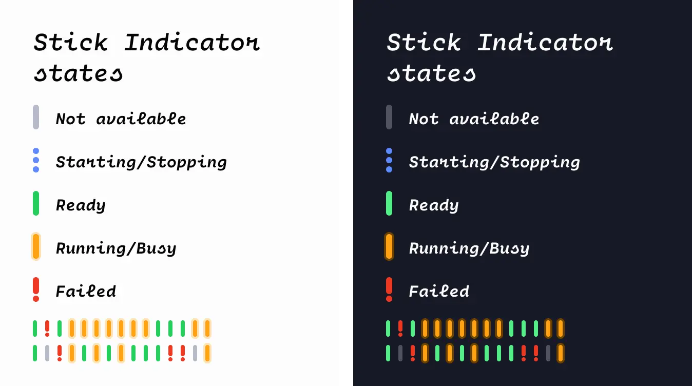
Designing the states for both light and dark themes helped keep their meaning consistent across the interface. The key decision was to use the available height more effectively without sacrificing quick recognition of individual slot states.
Putting the system to work
A new product emerged after the shared design system had already been established. Working with the Product Manager, I helped translate the product concept into functional flows and interface designs. I also collaborated with front-end developers and internal security specialists to account for technical and product requirements.
Outcome
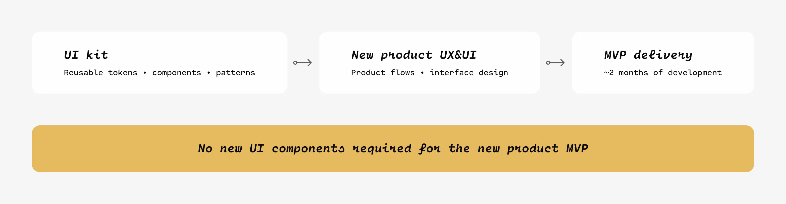
The development team delivered the new product MVP in approximately two months, using the existing UI kit without introducing new UI components. For me, this was a practical demonstration of the value of designing a system for reuse rather than for one interface at a time.
The Stick Indicator redesign illustrates the same approach at a smaller scale: adapting a reusable visual pattern to new capacity and layout requirements while keeping system states understandable.
This case study uses simplified, conceptual diagrams rather than internal product screenshots. The Stick Indicator image shows an isolated component study; specific product details are intentionally excluded.